Sunday 4 May 2014

Max Miedinger


Max Miedinger - Biography

This entire biography was sourced from historygraphicdesign.com and can be viewed here

Max Miedinger was born on Christmas day, 1910, in Zurich Switzerland.
When he was 16 years old, he became an apprentice typesetter in the book printing office of Jacques Bollmann in Zurich.
After four years of apprenticeship in the book office, Miedinger entered the School of Arts and Crafts, Abendkurse in Zurich.
In 1936, at the age of 26, he became a typographer in the advertising studio of the Globe department store chain. He worked at the Globe for ten years and refined his skill as a typographer.
After ten years at the Globe, he became a representative for the Type Foundry Haas in Basel Switzerland. This is where he would make his mark on graphic arts history, when in 1957 he revised a typeface called Akzidenze Grotesk—an old san serif font designed by the Berthold foundry in the late 1800s. His newly designed san serif was named Neue Haas Grotesk. Little did he know that, in the later 20th century, his neue sans serif typeface would become the default typeface for most software packages under its new name, Helvetica.

http://www.hca.uws.edu.au/student/101180/student/tuesday_2-4_roman/thomas_hayes/project1b/biography.htm

Max Miedinger's "Helvetica" was a revolutionary typeface and is still considered influential. The typeface is all over the world because it is so easy to read. It's design is flawless. You don't notice it at all, which is exactly the point. Miedinger's "Helvetica" is useful for my 2D course because it is an amazing example of design that is meant to be invisible to the eye.   

Milton Glaser


Milton Glaser
To many, Milton Glaser is the embodiment of American graphic design during the latter half of this century. His presence and impact on the profession internationally is formidable. Immensely creative and articulate, he is a modern renaissance man — one of a rare breed of intellectual designer-illustrators, who brings a depth of understanding and conceptual thinking, combined with a diverse richness of visual language, to his highly inventive and individualistic work. *

Born in 1929, Milton Glaser was educated at the High School of Music and Art and the Cooper Union art school in New York and, via a Fulbright Scholarship, the Academy of Fine Arts in Bologna, Italy. He co-founded the revolutionary Pushpin Studios in 1954, founded New York Magazine with Clay Felker in 1968, established Milton Glaser, Inc. in 1974, and teamed with Walter Bernard in 1983 to form the publication design firm WBMG. Throughout his career, Glaser has been a prolific creator of posters and prints. His artwork has been featured in exhibits worldwide, including one-man shows at both the Centre Georges Pompidou in Paris and the Museum of Modern Art in New York. His work is in the permanent collections of many museums. Glaser also is a renowned graphic and architectural designer with a body of work ranging from the iconic logo to complete graphic and decorative programs for the restaurants in the World Trade Center in New York. Glaser is an influential figure in both the design and education communities and has contributed essays and granted interviews extensively on design. Among many awards throughout the years, he received the 2004 Lifetime Achievement Award from the Smithsonian Cooper-Hewitt, National Design Museum, for his profound and meaningful long-term contribution to the contemporary practice of design.


* Excerpted from CSD, August/September, 1999 — "Milton Glaser: Always One Jump Ahead" by Patrick Argent
 http://www.miltonglaser.com/milton/#1 


I really like Milton Glaser's work as he can beautifully combine solid black images with imaginative colorful designs and he created some of the most recognizable logos of the 20th century. His work is playful and professional at the same time. It will benefit my 2D course because it's an example of combining block color with exciting colorful designs and how they neutralize each other into a beautifully balanced design.   


David Carson


Bio, David Carson

 David Carson is principal and chief designer of David Carson Design, Inc. with offices in del mar,california and zurich switzerland.

Carson graduated with “honors and distinction” from San Diego state university, where he received a BFA degree in sociology. A former professional surfer, he was ranked #9 in the world during his college days. Numerous groups including the New York Type Directors Club, American Center for Design and I.D. magazine have recognized his studio’s work with a wide range of clients in both the business and arts worlds. Carson and his work have been featured in over 180 magazine and newspaper articles around the world, including a feature in Newsweek magazine, and a front page article in the new york times . London-based Creative Review magazine dubbed Carson “Art Director of the Era.” The American Center for Design (Chicago) called his work on Ray Gun magazine “the most important work coming out of America.” His work on Beach Culture magazine won “Best Overall Design” and “Cover of the Year” from the Society of Publication Designers in New York.

Carson’s first book, with Lewis Blackwell, The End of Print, (forward by David Byrne) is the top selling graphic design book of all time, selling over 200,000 copies, and printed in 5 different languages.The work featured in The End of Print is the subject of various one-man exhibitions throughout Europe and Latin America,Asia and Australia. Carson’s other titles include 2nd Sight, Fotografiks (with design historian Philip Meggs). He has two recently released books, TREK and The Book of Probes with Marshall McLuhan. David is also art director for the Mcluhan estate(“the medium is the message”).

Carson lectures extensively throughout the world, as well as at colleges throughout the U.S., including Cranbrook, ARTcenter, Notre dame, RISD and Cal Arts. He has had numerous one man exhibitions of his work worldwide, and has spoken at over 100professional symposiums, including “Designer As Editor” at the Design Institute in Amsterdam. He teaches a week long workshop at the school of visual arts in nyc each summer.

The International Center for Photography (NY) singled out Carson as the “Designer of the Year” for his use of photography and design. Print Magazine proclaimed his work “Brilliant,” while USA Today described it as “visually stunning,” adding that his design of Ray Gun Magazine “may actually get young people reading again.”


Typography, a title published by Graphis magazine (NY), lists Carson as a “Master of Typography.” I.D. magazine chose Carson for their list of “America’s most innovative designers”. A feature in newsweek magazine said of Carson “he changed the public face of graphic design”. The graphic design publication Emigre devoted an entire issue to Carson, the only American designer to be so honored in the magazine’s history. And in April 2004, London based creative review magazine calls David, “the most famous graphic designer on the planet”. David recently picked up 4 gold awards at the Charleston ADDY awards, including a “special judges award” for “professionalism”.

In the past few years, Carson has branched out into film and television to direct commercials and videos. He directed the launch commercials for Lucent technologies and teamed up with William Burroughs in Carson’s short film, “The End of Print”. He also collaborated with Harvard Business School professor John Kao on a documentary entitled “The Art and Discipline of Creativity.” David designed the worldwide branding campaign for Microsoft, as well as the worldwide advertising for Giorgio Armani (Milan). He has appeared in advertisements endorsing Apple Computers, Samsung monitors and various paper companies. Carson has art directed and designed Surfer, twSkateboarding, twSnowboarding, Beach Culture, and Ray Gun magazines. He has an extensive list of international clients: Nine Inch nails, Toyota, mercedes benz, Bank of montreal, Microsoft, Quiksilver, Meg Ryan, David Byrne, Bush, Pepsi, and Xerox.

David is featured in both “The History of Graphic Design” by Philip Meggs, as well as”The Encylopedia of Surfing” by Matt Warsaw.

He designed a special issue of Surfing Magazine titled “Explorations” which came out in July of ’04. He also recently directed a television commercial for the progressive UMPQUA Bank in Seattle, Washington.

David’s work continues to be subjective and largely driven by intuition, with an emphasis on reading material before designing it, and experimenting with ways to communicate in a variety of mediums. Carson remains a hands on designer, keeping his studio small and mobile.

http://www.davidcarsondesign.com/t/about/


Carson's work will be helpful in my 2D course because it's an example of the flexibility type has. He shows how words can be beautiful as objects rather than a readable words.


Ronny Edry


Ronny Edry of Israel created The Peace Factory, an online movement for peace in the Middle East, when he posted a Facebook image that declared "Iranians, we will never bomb your country."

Why you should listen

Ronny Edry is a graphic designer, teacher and father. While he often posted images on Facebook without much fanfare, in March of 2012 one of his images garnered international attention. The image showed him with his daughter, along with the words “Iranians, we will never bomb your country. We heart you.” The image became a catalyst for dialogue between the people of two nations on the brink of war -- and started an online movement. Today, The Peace Factory is connecting people throughout the Middle East, giving them a voice and a face.
Edry grew up in Paris, France, and has lived in Israel since 1989. Along with his work on the Peace Factory, he is the owner and founder of Pushpin, a school for art and design in Tel Aviv. He himself graduated with honors from the BezIalel Academy of Art and Design, and he is a staff member teaching visual communication in design academies in Israel. He has received awards for his works as a graphic designer and is also an illustrator and author of graphic novels.

What others say

"It is not possible to dial an Iranian number from an Israeli telephone. It will simply not go through. That lack of communication stems from the government level, where there is no dialogue between the two countries aside from public speeches meant to carry weighty threats of war to each camp. That is why it was so difficult for Ronny Edry, an Israeli graphic designer based in Tel Aviv, to get his message across to the people of Iran." — CNN


Ronny Edry's work is stunning and innovative. It would have a great impact as a simple poster but by designing it for social media he reaches an enormously larger audience. Using limited colors, repeating phrases, and highlighting the keys words (I.E. "Israel" and "Palestine") the work can be quickly absorbed and is very attention grabbing. It's useful for my 2D course because it shows how to catch people's eyes and the power of work in different contexts.   


Josef Albers


In 1920, the young artist Josef Albers enrolled at the Bauhaus, the recently founded school of art, architecture, and design in Weimar, Germany. With its strong utilitarian emphasis, the Bauhaus placed equal importance on technical and artistic skills. The basis of its education was the "preliminary course," a curriculum designed to prepare the students for further study in the school's various workshops; the course's central concept was the "contrasting effects" of form, texture, and—most importantly for Albers—color.
After completing his course of study, Albers was appointed as a teacher at the Bauhaus in 1925, and he remained there until the school closed in 1933 under pressure from the Nazi party. He emigrated to the United States with his wife Anni and taught first at Black Mountain College in North Carolina, then at Yale University in New Haven, Connecticut. In this way, Albers disseminated his Bauhaus education and his own artistic philosophy to a new generation of artists in America. He also published the influential treatise Interaction of Color (1963), a study of color theory that was used widely in art instruction.

Around the time that he joined the Yale faculty in 1950, Albers began his celebrated Homage to the Square series. This would become a body of more than a thousand works executed over a period of twenty-five years, including paintings, drawings, prints, and tapestries. The entire series was based on a mathematically determined format of several squares, which appear to be overlapping or nested within one another. This geometric abstraction was Albers' template for exploring the subjective experience of color—the effects that adjacent colors have on one another, for example, and the illusion of flat planes of color advancing or receding in space.
With Rays is one painting from the Homage to the Square series (see also Homage to the Square: Soft Spoken, 1972.40.7). Its color composition is comprised of an inner square of dull gray and three surrounding squares in varying tones of yellow. The gray square, the palest of the four, seems to float against its more vivid background; this arrangement also encourages the viewer's eye to move outward from the center of the composition. That optical progression, in addition to the sun-like, golden tones of the three outer squares, may have inspired the title of this work.

http://www.metmuseum.org/toah/works-of-art/59.160


I find the work of Josef Albers to be calming and intriguing. The mathematical foundation limits the work to simple elements but creates a balanced composition and his skills with color makes surprising optical allusions. At first I wasn't overly keen on his work but, after reading about what he was aiming to achieve, I now have a strong respect for it. Albers will be helpful for my 2D course because he shows the power of colors and well composed elements.       


Herb Lubalin


http://www.printmag.com/interviews/designer-for-the-age-of-austerity-adrian-shaughnessy-on-herb-lubalins-life-and-work/

Most people recognize the name Herb Lubalin in association with the typeface Avant Garde. And he was the typographer and designer behind its creation, after the success of Avant Garde Magazine and its typographic logo. But, his career spanned a much wider scope than that. One of the people behind the culture-shocking magazines Avant-Garde, Eros and Fact, he was a constant boundary breaker on both a visual and social level. Part of the founding team of the International Typeface Corporation (ITC) and the principal of Herb Lubalin, Inc it was hard to escape the reach of Herb during the 1960s and 70s.


His constant search for something new and a passion for inventiveness made him one of the most successful art directors of the 20th century. He had offices internationally in Paris and London and partnered with many talented individuals over the years including Aaron Burns, Tom Carnase, Ernie Smith and Ralph Ginzburg. A graduate of the Cooper Union in New York he spent time as a visiting professor there as well as designed a logo for them. Constantly working and achieving much success throughout his career, at the age of 59 he proclaimed "I have just completed my internship."


http://www.designishistory.com/1960/herb-lubalin/

 http://meetinghouse.co/2013/02/10/inspiration-herb-lubalin/


More information on Lubalin can be found at http://www.aiga.org/interior.aspx?pageid=44&id=3179 

http://fontsinuse.com/uses/2059/1972-christmas-new-year-greeting-card


I love the work of Herb Lubalin. Though his type is illustrative, it is easily read and he knew exactly how to make the type, itself, beautiful. Lubalin also had a wonderful way with words, which made for stunning and memorable designs when combined with his unique type designs. His work is very helpful for my 2D course because he shows how attention to a few elements can be as visually satisfying as a lot of elements.  


Tuesday 15 April 2014

Anthony Burrill

 
http://www.digitalartsonline.co.uk/news/illustration/anthony-burrill-poster-book-gives-you-30-wryly-inspirational-prints/

 BIOGRAPHY

Graphic artist, print-maker and designer Anthony Burrill is known for his persuasive, up-beat style of communication. His work is held in the permanent collections of the Victoria and Albert Museum in London, the Cooper-Hewitt National Design Museum, New York and has been exhibited in galleries around the world including The Barbican, The Walker Art Centre and The Graphic Design Museum, Breda. In 2012, he made his first foray into curating with the exhibition Made in L.A. - Work by Colby Poster Printing, at KK Outlet in London.
Words and language are an important part of Burrill’s output and he has developed a distinctive voice that is sought after not only by collectors of his posters and prints but also by clients including Wallpaper* magazine, The Economist, The British Council, London Underground and The Design Museum. Burrill is perhaps best known for his typographic, text-based compositions, including the now-famous “Work Hard and Be Nice to People”, which has become a mantra for the design community and beyond.
Burrill has a long-standing relationship with the printers Adams of Rye where he uses traditional techniques to compose and print his work. The integrity lent to the process of image-making by hand-made methods is essential to his practice across all media — from print, to screen-based, to three-dimensional applications. In 2010 he worked with Happiness Brussels to design a screen-printed poster made with oil and sand collected from the beaches of the Gulf of Mexico disaster. Proceeds from the sale of the limited edition poster “Oil & Water Do Not Mix” went to CRCL (Coalition to Restore Coastal Louisiana) and copies were acquired by the V&A and Cooper-Hewitt for their collections.

http://coolmompicks.com/blog/2013/05/09/inspiring-posters-words-work-hard/

While Burrill’s work is grounded in a serious devotion to his art, he has a lightness of touch and humour that, although often copied, is unique in the field of graphic communication. He frequently embarks on innovative collaborations with friends and fellow creatives. Recent and regular colluders include product designer Michael Marriott, writer and philosopher Alain de Botton, designer Ben Kelly and creative director Erik Kessels.
Installations, events and work in three dimensions punctuate Burrill’s practice. At the renowned annual graphic art fair Pick Me Up at Somerset House in London in 2011, Burrill re-located his studio to the gallery and held workshops and daily collaborations with fellow designers, illustrators, photographers and musicians over the course of ten days. For Graphic Design Worlds at the Triennale di Milano in 2011 Burrill and Michael Marriott built and installed a red-timbered chalet structure, clad with recreations of Burrill’s work cut from multi-veneer board.
As well as his self-authored work and commissioned design, Burrill makes regular appearances at events and talks worldwide. He also runs creative workshops attended by children, students and creative professionals alike. He documents and communicates his work and points of inspiration prolifically via social media, with thousands of followers on Twitter, Instagram and Tumblr.
Burrill was born in Littleborough, Lancashire. After studying Graphic Design at Leeds Polytechnic he completed an MA in Graphic Design at the Royal College of Art, London. He now lives and works on the Isle of Oxney, Kent.

http://www.anthonyburrill.com/about/biography

http://www.thisiscolossal.com/tags/typography/page/12/ 


Anthony Burrill's work is beautiful. By using the traditional printing press he gives his work a homely and warm atmosphere. It also allows him to create crisp pieces of work that are always slightly varied. This makes every poster it's own exciting piece. The type is basic and bold, simply stating the message with no urgency or abruptness. The works are easy overlooked but, once noticed, they are unforgettable. The simplicity of the coloration and type makes his posters easy to absorb and highlights the individual differences. Burrill keeps us on our toes with clever ideas like the 'Oil & Water Do Not Mix' poster, which was printed in oil from the Gulf of Mexico oil-spill disaster. This brought a completely new message to the poster. The phrases he uses are uplifting and lighthearted when they aren't political messages. If collected together, they would create a fantastic manifesto. His work will be helpful in my 2D course because it provides beautiful examples of how basic, clear designs can enliven a message.     


Stefan Sagmeister

Stefan Sagmeister

 
http://www.huffingtonpost.com/kisa-lala/
 
 
Graphic Designer (1962-)
Design Museum Collection

STEFAN SAGMEISTER (1962-) is among today’s most important graphic designers. Born in Austria, he now lives and works in New York. His long-standing collaborators include the AIGA and musicians, David Byrne and Lou Reed.
When Stefan Sagmeister was invited to design the poster for an AIGA lecture he was giving on the campus at Cranbrook near Detroit, he asked his assistant to carve the details on to his torso with an X-acto knife and photographed the result. Sunning himself on a beach the following summer, Sagmeister noticed traces of the poster text rising in pink as his flesh tanned.
Now a graphic icon of the 1990s, that 1999 AIGA Detroit poster typifies Stefan Sagmeister’s style. Striking to the point of sensationalism and humorous but in such an unsettling way that it’s nearly, but not quite unacceptable, his work mixes sexuality with wit and a whiff of the sinister. Sagmeister’s technique is often simple to the point of banality: from slashing D-I-Y text into his own skin for the AIGA Detroit poster, to spelling out words with roughly cut strips of white cloth for a 1999 brochure for his girlfriend, the fashion designer, Anni Kuan. The strength of his work lies in his ability to conceptualise: to come up with potent, original, stunningly appropriate ideas.
Born in Bregenz, a quiet town in the Austrian Alps, in 1962, Sagmeister studied engineering after high school, but switched to graphic design after working on illustrations and lay-outs for Alphorn, a left-wing magazine. The first of his D-I-Y graphic exercises was a poster publicising Alphorn’s Anarchy issue for which he persuaded fellow students to lie down in the playground in the shape of the letter A and photographed them from the school roof.
At 19, Sagmeister moved to Vienna hoping to study graphics at the city’s prestigious University of Applied Arts. After his first application was rejected – "just about everybody was better at drawing than I was" – he enrolled in a private art school and was accepted on his second attempt. Through his sister’s boyfriend, the rock musician, Alexander Goebel, Sagmeister was introduced to the Schauspielhaus theatre group and designed posters for them as part of the Gruppe Gut collective. Many of the posters parodied traditionally twee theatrical imagery and offset it with roughly printed text in the grungey typefaces of punk albums and 1970s anarchist graphics.
In 1987, Sagmeister won a Fulbright scholarship to study at the Pratt Institute in Brooklyn, New York. Here humour emerged as the dominant theme in his work. When a girlfriend asked him to design business cards which would cost no more than $1 each, Sagmeister printed them on dollar bills. And when a friend from Austria came to visit, having voiced concern that New York women would ignore him, Sagmeister postered the walls of his neighbourhood with a picture of his friend under the words "Dear Girls! Please be nice to Reini".
After three years in the US, Sagmeister returned to Austria for compulsory military service. As a conscientious objector, he was allowed to do community work in a refugee centre outside Vienna. He stayed in Austria working as a graphic designer before moving to Hong Kong in 1991 to join the advertising agency, Leo Burnett. "They asked if I would be interested in being a typographer, " he later told the author, Peter Hall. "So I made up a high number and said I would do it for that." When the agency was invited to design a poster for the 1992 4As advertising awards ceremony, Sagmeister depicted a traditional Cantonese image featuring four bare male bottoms. Some ad agencies boycotted the awards in protest and the Hong Kong newspapers received numerous letters of complaint. Sagmeister’s favourite said: "Who’s the asshole who designed this poster?" By spring 1993, he had tired of Hong Kong. Sagmeister spent a couple of months working from a Sri Lankan beach hut before going back to New York.
As a Pratt Institute student, his dream had been to work at M&Co, the late Tibor Kalman’s graphics studio. Sagmeister bombarded Kalman with calls and finally persuaded him to sponsor his green card application. Four years later on his return from Hong Kong, the green card came through. His first project for M&Co was an invitation for a Gay and Lesbian Taskforce Gala for which he designed a prettily packaged box of fresh fruit. Cue a logistical nightmare as M&Co’s staff struggled to stop the fruit rotting in the heat of a sweltering New York summer. A few months later, Tibor Kalman announced that he was closing the studio to move to Rome, and Sagmeister set up on his own.
His goal was to design music graphics, but only for music he liked. To have the freedom to do so, Sagmeister decided to follow Kalman’s advice by keeping his company small with a team of three: himself, a designer (since 1996, the Icelander, Hjalti Karlsson) and an intern. Sagmeister Inc’s first project was its own business card, which came in an acrylic slipcase. When the card is inside the case, all you see is an S in a circle. Once outside, the company’s name and contract details appear. The second commission came from Sagmeister’s brother, Martin who was opening Blue, a chain of jeans stores in Austria. Sagmeister devised an identity consisting of the word blue in black type on an orange background.

http://mediaofzion.squarespace.com/home/2009/12/28/profile-of-stefan-sagmeister.html

As none of the record labels he approached seemed interested in his work, Sagmeister seized the chance to design a CD cover for a friend’s album, H.P. Zinker’s Mountains of Madness. Many of his contemporaries felt that music graphics had become less interesting once their old canvas, the vinyl LP cover, had shrunk to the dimensions of a CD, but Sagmeister saw the CD as a toy with which he could tantalise consumers. Having spotted a schoolgirl on the subway reading a maths text book through a red plastic filter, he placed his CD cover inside a red-tinted plastic case. Replicating the optical illusion of his business card, the complete packaging shows a close-up of a placid man’s face, but once the CD cover is slipped out from the red plastic, the man’s face appears furious in shades of red, white and green. Mountains of Madness won Sagmeister the first of his four Grammy nominations.
Invited by Lou Reed to design his 1996 album Set the Twilight Reeling, Sagmeister inserted an indigo portrait of Reed in an indigo-tinted plastic CD case. When the paler coloured cover is removed, Reed literally emerges from the twilight. The following year, Sagmeister depicted David Byrne as a plastic GI Joe-style doll on the cover of Feelings. One of his trickiest assignments was for the Rollings Stones’ 1997 Bridges to Babylon album and tour. Sagmeister struggled to persuade the band’s management to accept his motif of a lion inspired by an Assyrian sculpture in the British Museum. Also the astrological sign of the Rolling Stones’ lead singer, Mick Jagger (a Leo), the lion doubled as an easily reproducible motif for tour merchandise.
As well as these music projects, Sagmeister still took on other commercial commissions and pro bono cultural projects, such as his AIGA lecture posters. The obscenely elongated wagging tongues of 1996’s Fresh Dialogue talks series in New York and a Headless Chicken strutting across a field for 1997’s biennial conference in New Orleans culminated in the drama of Sagmeister’s scarred, knife-slashed torso for 1999’s deceptively blandly titled, AIGA Detroit.
In June 2000, Sagmeister decided to treat himself to a long-promised year off to concentrate on experimental projects and a book Sagmeister, sub-titled Made You Look with the sub-sub-title Another self-indulgent design monograph (practically everything we have ever designed including the bad stuff.) The worst of the "bad stuff" was a 1996 series of CD-Rom covers for a subsidiary of the Viacom entertainment group. "Don’t take on any more bad jobs," Sagmeister scolded himself in his diary. "I have done enough bullshit lately, I just have to make time for something better. Something good."
© Design Museum 
http://designmuseum.org/design/stefan-sagmeister

http://www.onb.ac.at/sammlungen/plakate/archiv/erwerb/objekt_august.htm 

 
Stefan Sagmeister's work appeals because I've never seen anything like it before; it is totally unique. Everything he does is wackie, random, and usually appears to have no relevance to the clients he's promoting. Every crazy idea is different and they can vary from overtly sexual to sinister to hilarious, often incorporating all three. Though his work can be shocking, repulsive, and terrifying it's almost a breath of fresh air because it's so different to anything else. It's great for my 2D course because he shows how random and playful good design can be.

Paul Rand


PAUL RAND (BORN PERETZ ROSENBAUM, AUGUST 15, 1914 – NOVEMBER 26, 1996) was a well-known American graphic designer, best known for his corporate logo designs. Rand was educated at the Pratt Institute (1929-1932), the Parsons School of Design (1932-1933), and the Art Students League (1933-1934). He was one of the originators of the Swiss Style of graphic design. From 1956 to 1969, and beginning again in 1974, Rand taught design at Yale University in New Haven, Connecticut. Rand was inducted into the New York Art Directors Club Hall of Fame in 1972. He designed many posters and corporate identities, including the logos for IBM, UPS and ABC. Rand died of cancer in 1996.


Although Rand was most famous for the corporate logos he created in the 1950s and 1960s, his early work in page design was the initial source of his reputation. In 1936, Rand was given the job of setting the page layout for an Apparel Arts magazine anniversary issue. “His remarkable talent for transforming mundane photographs into dynamic compositions, which [. . .] gave editorial weight to the page” earned Rand a full-time job, as well as an offer to take over as art director for the Esquire-Coronet magazines. Initially, Rand refused this offer, claiming that he was not yet at the level the job required, but a year later he decided to go ahead with it, taking over responsibility for Esquire’s fashion pages at the young age of twenty-three.

The cover art for Direction magazine proved to be an important step in the development of the “Paul Rand look” that was not as yet fully developed. The December 1940 cover, which uses barbed wire to present the magazine as both a war-torn gift and a crucifix, is indicative of the artistic freedom Rand enjoyed at Direction; in Thoughts on Design Rand notes that it “is significant that the crucifix, aside from its religious implications, is a demonstration of pure plastic form as well . . . a perfect union of the aggressive vertical (male) and the passive horizontal (female).” In ways such as this, Rand was experimenting with the introduction of themes normally found in the “high arts” into his new graphic design, further advancing his life-long goal of bridging the gap between his profession and that of Europe’s modernist masters.


Though Rand was a recluse in his creative process, doing the vast majority of the design load despite having a large staff at varying points in his career, he was very interested in producing books of theory to illuminate his philosophies. Maholy-Nagy may have incited Rand’s zeal for knowledge when he asked his colleague if he read art criticism at their first meeting. Rand said no, prompting Moholy-Nagy to reply “Pity.” Heller elaborates on this meeting’s impact, noting that, “from that moment on, Rand devoured books by the leading philosophers on art, including Roger Fry, Alfred North Whitehead, and John Dewey.” These theoreticians would have a lasting impression on Rand’s work; in a 1995 interview with Michael Kroeger discussing, among other topics, the importance of Dewey’s Art as Experience, Rand elaborates on Dewey’s appeal:
[. . . Art as Experience] deals with everything—there is no subject he does not deal with. That is why it will take you one hundred years to read this book. Even today’s philosophers talk about it[.] [E]very time you open this book you find good things. I mean the philosophers say this, not just me. You read this, then when you open this up next year, that you read something new.

As is obvious, Dewey is an important source for Rand’s underlying sentiment in graphic design; on page one of Rand’s groundbreaking Thoughts on Design, the author begins drawing lines from Dewey’s philosophy to the need for “functional-aesthetic perfection” in modern art. Among the ideas Rand pushed in Thoughts on Design was the practice of creating graphic works capable of retaining their recognizable quality even after being blurred or mutilated, a test Rand routinely performed on his corporate identities.


Paul Rand, American Modernist, was one of the originators of Swiss Style of graphic design. He is best known for his work and design on corporate logos. He was born on 15th August 1914 and passed away on 26 November 2006 at the aged of 82 years old, from cancer. He was educated at Pratt Institute, Parsons The New School of Design and then the Arts Student League. He taught design at Yale University in New Haven for a few years. Though he was famous for his corporate logo works, he’s initial reputation was built on ‘page design when he was tasked the job of setting the page layout for the anniversary issue of Apparel Arts’ magazine, which earned him a full time job.


Paul Rand was able to create instantly recognizable designs and his logos and brands became as familiar as the furniture. He did this by keeping his designs very simple which meant you could grasp the gist of a company in a single glance and wouldn't forget their branding very easily. He harmoniously combined geometric shapes, a limited color pallet, expert typography, and basic illustrations to create work that was easy on the eye and effortless to absorb. His work is useful for my 2D class because it shows how recognizable an image can be when harmoniously combining a few, well thought through, elements.   


Saturday 22 March 2014

George Condo

George Condo

 http://cityzenart.blogspot.com/2011/01/george-condo.html

With his peculiar, signature brand of cartoonish figuration, George Condo has been celebrated both in the art world and in popular culture, with a 2011 retrospective at the New Museum and album covers for musicians including Kanye West and Danny Elfman. Condo’s work plays much earlier models of realism: Spanish still life painting, royal portraiture, genre painting, and others. The subjects of his portraits are sometimes real, sometimes imaginary, and are often placed into narrative scenes of champagne and cigar debauchery, both modern and antique. He regularly varies his mode of representation within a painting. In his 2010 painting Not Yet Titled Condo alludes to group portraits by Goya and to Manet’s Le déjeuner sur l’herbe (1863), with cavorting nudes and men primly dressed in satin smoking jackets. But the faces of all the revelers are made to look like cartoonish, lumpy, keloid grimaces with saw-like teeth and bulging eyes. His mode of social commentary dates back hundreds of years, but his subjects are very often contemporary.

 http://www.phillips.com/search/1/?search=condo


Condo is the recipient of an award from the American Academy of Arts and Letters, the Francis J. Greenberger award, and the Annual Artist’s Award from ArtsConnection, New York. He has been included in two Whitney Biennial exhibitions and numerous museum exhibitions` worldwide. Condo’s 2011 retrospective, “Mental States,” traveled from New York to Rotterdam, London, and Frankfurt over the course of the year.
http://www.artspace.com/george_condo?gclid=CMPAxeCMzbwCFREaOgodIHoAIQ

 http://www.aqnb.com/2011/11/07/the-ugly-truth/


George Condo's work is relevant to my 2D course because he shows how you can sharply twist the context of a piece of work by altering specific characteristics. He makes you do a double-take by subtly placing explicit objects and images in his work. Condo's twists give his paintings a dark humor and provide scary surprises.


Shirin Neshat

http://www.tribesandthings.com/2013/04/19/artistic-goddess-shirin-neshat/


http://gladstonegallery.com/sites/default/files/SN_NYT_Nov12.pdf


http://ragazine.cc/2012/10/feminist-art-of-the-middle-east/

Although Shirin Neshat's work is very focused on politics and religion, I love it for its content. Her combination of black and white photographs with calligraphy makes for powerful, elegant pieces of art. By painting onto the photographs (instead of painting the subject directly and then photographing) she's creates a story-like image which is made mystical and captivating by the calligraphy.
Shirin's work is useful for my 2D course because she shows how the simple combination of two different elements (photographs and calligraphy) can have powerful results. 

Friday 14 February 2014

Mark Lombardi


Mark Lombardi, 48, an Artist Who Was Inspired by Scandals

 http://www.francescofranchi.com/graphic-literature

By ROBERTA SMITH

Published: March 25, 2000

Mark Lombardi, an artist whose elegant, minutely detailed diagrams of political and financial scandals brought a distinctive voice to late Conceptualism, was found hanged in his loft in Williamsburg, Brooklyn, on Wednesday evening, the police said. He was 48. A spokesman for the 90th Precinct in Williamsburg said that a autopsy had been ordered by the medical examiner.

As an artist, Mr. Lombardi was an unusual case: a late bloomer who developed his mature style after the age of 40, but who was experiencing the rapid ascent of a younger artist. One of his large drawings, an airy composition of small circles and crisscrossing arced lines that resembled rose windows or fanciful architectural rendering, is included in the ''Greater New York'' exhibition at P.S. 1 in Long Island City.

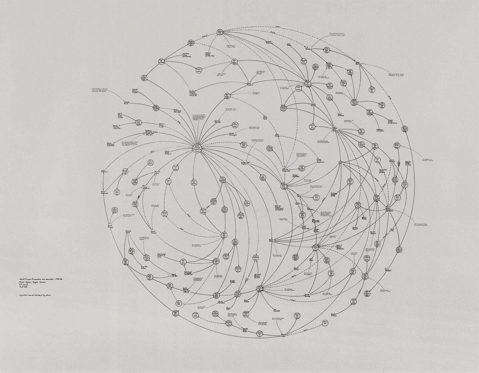
Mr. Lombardi's interest in presenting pure information qualified him as a Conceptual artist, but in many ways he was an investigative reporter after the fact. He liked to say that his drawings were probably best understood by the newspaper reporters who had covered the scandals he diagrammed. Sometimes measuring as much as 10 feet across, these drawings nonetheless had tremendous visual verve, delicately tracing the convoluted unfoldings of contemporary morality tales like the savings and loan scandal, Whitewater, Iran-contra and the Vatican bank scandal. The small circles in his drawings identified the main players -- individuals, corporations and governments -- along a time line. The arcing lines showed personal and professional links, conflicts of interest, malfeasance and fraud. Solid lines traced influence, dotted lines traced assets and wavy lines traced frozen assets. Final denouements like court judgment, bankruptcy and death were noted in red.
 http://www.aurelscheibler.com/exhibitions/shadowexistence-1245967200?works&ssc=1,26

Mr. Lombardi, who was born in Syracuse in 1951, received a bachelor's degree in art history from Syracuse University. After graduating from college he moved to Houston, where he worked briefly as an assistant curator at the Museum of Contemporary Art. Mr. Lombardi ran a small gallery while making abstract paintings on the side. He began making his drawings in 1993, inspired by a doodled diagram he had made while talking on the phone to a banker friend about the savings and loan scandal. Reading several newspapers a day, he culled his information entirely from published sources, keeping track of the articles with a card file that eventually held over 12,000 cards. Mr. Lombardi began exhibiting his drawings in Houston in 1995. He came to wider attention in a group show at the Drawing Center in SoHo in 1997. He moved to New York and had his first solo show, ''Silent Partners,'' in 1998 at Pierogi 2000, a gallery in Williamsburg. His second show, ''Vicious Circles,'' was at the Devon Golden Gallery in Chelsea in 1999.
http://www.nytimes.com/2000/03/25/arts/mark-lombardi-48-an-artist-who-was-inspired-by-scandals.html

 http://www.flickr.com/photos/happyfamousartists/5533439294/

Mark Lombardi's work is fascinating. The combination of enticing subject matter (conspiracies and scandals) and visual organization make these drawings a mysterious adventure. Looking at them is a lot like reading a murder mystery because his compositions pull your eyes to each individual lot of information, slowly piecing together the conclusion of the piece. The simplicity of the lines and concise information makes the subject matter easy to follow and allows your imagination to run wild.

Lombardi's work is valuable to my 2D course because he provides a great example of communicating information simply but beautifully. He uses composition and line to tell a story and he adds colour to create drama.


Sunday 9 February 2014

Lari Pittman

Lari Pittman 

http://www.art21.org/images/lari-pittman/out-of-the-frost-1986


Biography

Lari Pittman was born in Los Angeles, California in 1952. Pittman received both a BFA (1974) and an MFA (1976) from California Institute of the Arts, Valencia. Inspired by commercial advertising, folk art, and decorative traditions, his meticulously layered paintings transform pattern and signage into luxurious scenes fraught with complexity, difference, and desire. In a manner both visually gripping and psychologically strange, Pittman’s hallucinatory works reference myriad aesthetic styles, from Victorian silhouettes to social realist murals to Mexican retablos. Pittman uses anthropomorphic depictions of furniture, weapons, and animals, loaded with symbolism, to convey themes of romantic love, violence, and mortality. His paintings and drawings are a personal rebellion against rigid, puritanical dichotomies. They demonstrate the complementary nature of beauty and suffering, pain and pleasure, and direct the viewer’s attention to bittersweet experiences and the value of sentimentality in art. Despite subject matter that changes from series to series, Pittman’s deployment of simultaneously occurring narratives and opulent imagery reflects the rich heterogeneity of American society, the artist’s Colombian heritage, and the distorting effects of hyper-capitalism on everyday life.

https://www.pbs.org/art21/artists/pittman/

http://dailyserving.com/2010/10/lari-pittman-at-regen-projects/lp-398/

In this video, Lari Pittman discusses his work. His section starts at 14:30 and ends at 26:30. http://video.pbs.org/video/1239665588/ 

http://www.testpress.net/friezeny2012_day2.html

Lari Pittman's work is wonderfully spontaneous. His paintings are a cocktail of real objects, patterning, vivid colors, typography, and imaginative hybrids of objects and figures. Though his work is a lot to take in, it is not overwhelming. This is because of his fantastic compositions. Every element is balanced and benefits the painting. His paintings are so rich in detail that you have to examine them for hours to appreciate all of their beautiful elements. 

Pittman's paintings are helpful because they show how to organize many crazy elements into a beautiful composition. His wackie work inspires the imagination and brings a smile to your face.