Friday 14 February 2014

Mark Lombardi


Mark Lombardi, 48, an Artist Who Was Inspired by Scandals

 http://www.francescofranchi.com/graphic-literature

By ROBERTA SMITH

Published: March 25, 2000

Mark Lombardi, an artist whose elegant, minutely detailed diagrams of political and financial scandals brought a distinctive voice to late Conceptualism, was found hanged in his loft in Williamsburg, Brooklyn, on Wednesday evening, the police said. He was 48. A spokesman for the 90th Precinct in Williamsburg said that a autopsy had been ordered by the medical examiner.

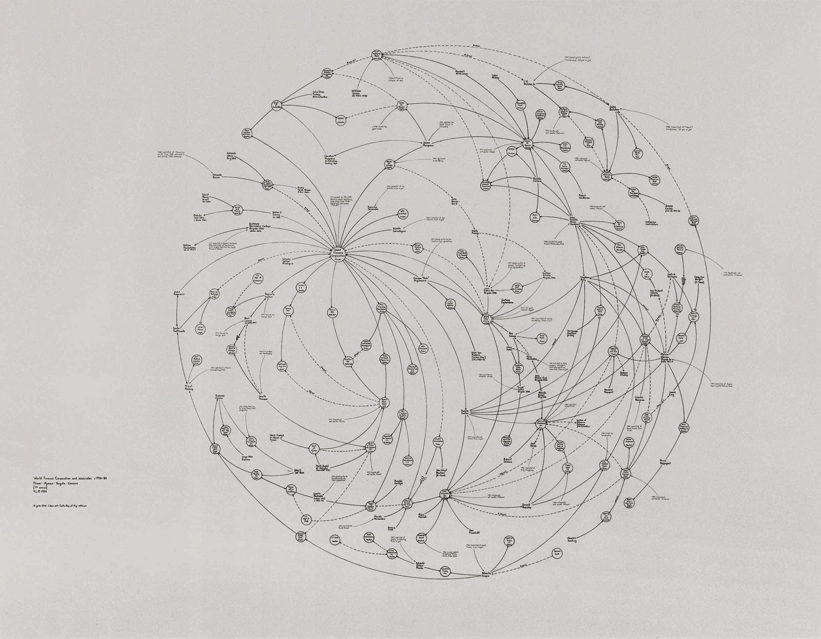
As an artist, Mr. Lombardi was an unusual case: a late bloomer who developed his mature style after the age of 40, but who was experiencing the rapid ascent of a younger artist. One of his large drawings, an airy composition of small circles and crisscrossing arced lines that resembled rose windows or fanciful architectural rendering, is included in the ''Greater New York'' exhibition at P.S. 1 in Long Island City.

Mr. Lombardi's interest in presenting pure information qualified him as a Conceptual artist, but in many ways he was an investigative reporter after the fact. He liked to say that his drawings were probably best understood by the newspaper reporters who had covered the scandals he diagrammed. Sometimes measuring as much as 10 feet across, these drawings nonetheless had tremendous visual verve, delicately tracing the convoluted unfoldings of contemporary morality tales like the savings and loan scandal, Whitewater, Iran-contra and the Vatican bank scandal. The small circles in his drawings identified the main players -- individuals, corporations and governments -- along a time line. The arcing lines showed personal and professional links, conflicts of interest, malfeasance and fraud. Solid lines traced influence, dotted lines traced assets and wavy lines traced frozen assets. Final denouements like court judgment, bankruptcy and death were noted in red.
 http://www.aurelscheibler.com/exhibitions/shadowexistence-1245967200?works&ssc=1,26

Mr. Lombardi, who was born in Syracuse in 1951, received a bachelor's degree in art history from Syracuse University. After graduating from college he moved to Houston, where he worked briefly as an assistant curator at the Museum of Contemporary Art. Mr. Lombardi ran a small gallery while making abstract paintings on the side. He began making his drawings in 1993, inspired by a doodled diagram he had made while talking on the phone to a banker friend about the savings and loan scandal. Reading several newspapers a day, he culled his information entirely from published sources, keeping track of the articles with a card file that eventually held over 12,000 cards. Mr. Lombardi began exhibiting his drawings in Houston in 1995. He came to wider attention in a group show at the Drawing Center in SoHo in 1997. He moved to New York and had his first solo show, ''Silent Partners,'' in 1998 at Pierogi 2000, a gallery in Williamsburg. His second show, ''Vicious Circles,'' was at the Devon Golden Gallery in Chelsea in 1999.
http://www.nytimes.com/2000/03/25/arts/mark-lombardi-48-an-artist-who-was-inspired-by-scandals.html

 http://www.flickr.com/photos/happyfamousartists/5533439294/

Mark Lombardi's work is fascinating. The combination of enticing subject matter (conspiracies and scandals) and visual organization make these drawings a mysterious adventure. Looking at them is a lot like reading a murder mystery because his compositions pull your eyes to each individual lot of information, slowly piecing together the conclusion of the piece. The simplicity of the lines and concise information makes the subject matter easy to follow and allows your imagination to run wild.

Lombardi's work is valuable to my 2D course because he provides a great example of communicating information simply but beautifully. He uses composition and line to tell a story and he adds colour to create drama.


Sunday 9 February 2014

Lari Pittman

Lari Pittman 

http://www.art21.org/images/lari-pittman/out-of-the-frost-1986


Biography

Lari Pittman was born in Los Angeles, California in 1952. Pittman received both a BFA (1974) and an MFA (1976) from California Institute of the Arts, Valencia. Inspired by commercial advertising, folk art, and decorative traditions, his meticulously layered paintings transform pattern and signage into luxurious scenes fraught with complexity, difference, and desire. In a manner both visually gripping and psychologically strange, Pittman’s hallucinatory works reference myriad aesthetic styles, from Victorian silhouettes to social realist murals to Mexican retablos. Pittman uses anthropomorphic depictions of furniture, weapons, and animals, loaded with symbolism, to convey themes of romantic love, violence, and mortality. His paintings and drawings are a personal rebellion against rigid, puritanical dichotomies. They demonstrate the complementary nature of beauty and suffering, pain and pleasure, and direct the viewer’s attention to bittersweet experiences and the value of sentimentality in art. Despite subject matter that changes from series to series, Pittman’s deployment of simultaneously occurring narratives and opulent imagery reflects the rich heterogeneity of American society, the artist’s Colombian heritage, and the distorting effects of hyper-capitalism on everyday life.

https://www.pbs.org/art21/artists/pittman/

http://dailyserving.com/2010/10/lari-pittman-at-regen-projects/lp-398/

In this video, Lari Pittman discusses his work. His section starts at 14:30 and ends at 26:30. http://video.pbs.org/video/1239665588/ 

http://www.testpress.net/friezeny2012_day2.html

Lari Pittman's work is wonderfully spontaneous. His paintings are a cocktail of real objects, patterning, vivid colors, typography, and imaginative hybrids of objects and figures. Though his work is a lot to take in, it is not overwhelming. This is because of his fantastic compositions. Every element is balanced and benefits the painting. His paintings are so rich in detail that you have to examine them for hours to appreciate all of their beautiful elements. 

Pittman's paintings are helpful because they show how to organize many crazy elements into a beautiful composition. His wackie work inspires the imagination and brings a smile to your face.       


Ellen Gallagher

Ellen Gallagher


 http://www.tate.org.uk/art/artworks/gallagher-deluxe-t12301/image-291874


Ellen Gallagher was born in Providence, Rhode Island, in 1965, and lives and works in New York and Rotterdam, Holland. She attended Oberlin College and the School of the Museum of Fine Arts, Boston. Repetition and revision are central to Gallagher’s treatment of advertisements that she appropriates from popular magazines like “Ebony,” “Our World,” and “Sepia” and uses in works like “eXelento” (2004) and “DeLuxe” (2004-05). Initially, Gallagher was drawn to the wig advertisements because of their grid-like structure. Later she realized that it was the accompanying language that attracted her, and she began to bring these ‘narratives’ into her paintings—making them function through the characters of the advertisements as a kind of chart of lost worlds. Although the work has often been interpreted strictly as an examination of race, Gallagher also suggests a more formal reading with respect to materials, processes, and insistences. From afar, the work appears abstract and minimal. Upon closer inspection, googly eyes, reconfigured wigs, tongues, and lips of minstrel caricatures multiply in detail.


 http://binewin.blogspot.com/2012/02/mehr-wunder.html

Gallagher has been influenced by the sublime aesthetics of Agnes Martin’s paintings as well the subtle shifts and repetitions of Gertrude Stein’s writing. In her earlier works, Gallagher glued pages of penmanship paper onto stretched canvas and then drew and painted on it. In “Watery Ecstatic” (2002-04), she literally carved images into thick watercolor paper in her own version of scrimshaw, from which emerge images of the sea creatures from Drexciya, a mythical underwater Black Atlantis. Gallagher received the American Academy Award in Art and a Joan Mitchell Foundation Fellowship. Solo exhibitions include the Whitney Museum of American Art; Museum of Contemporary Art, North Miami; St. Louis Art Museum; Des Moines Art Center; Yerba Buena Center for the Arts, San Francisco; and ICA Boston. 

https://www.pbs.org/art21/artists/gallagher/
  
This is a video in which Ellen Gallagher discusses her work and process. From 13:30 to 25:23. http://video.pbs.org/video/1239627128/

 http://www.tate.org.uk/art/artworks/gallagher-deluxe-t12301/image-291868

Ellen Gallagher's work is quirky and clever. Using only a few base images, she is able to create hundreds of unique works, and beautifully link them into one huge presentation of work. She uses very few elements, her coloring is similar in each piece, and the added elements are basic blocks and patterns of color. These simple changes poke fun at the original magazine images and adverts. 

Gallagher's work is great inspiration for my 2D course because she shows how one image can be reproduced a hundred different ways. She also provides great examples of linking multiple work together into one beautiful composition.     


Sol Lewitt

http://publicdelivery.org/sol-lewitt-wall-drawings/


Sol LeWitt (1928 – 2007)

Sol LeWitt was born on September 9th, 1928 in Hartford, Connecticut to Eastern European immigrants. His father, a doctor and inventor, died when he was 6.  Soon after, he moved with his mother, a nurse, to live with an aunt in New Britain, Connecticut.  His mother took him to art classes at the Wadsworth Atheneum in Hartford and he would draw on wrapping paper from his aunt’s grocery store.

In 1960, he took an entry-level job at the Museum of Modern Art, where he met Dan Flavin, Robert Ryman, Lucy Lippard and Robert Mangold. Together, through the “Sixteen Americans” exhibition, they were introduced to the work of Jasper Johns and Frank Stella and Robert Rauschenberg.

LeWitt was also interested in Russian Constructivism, with its engineering aesthetic and the idea of making utilitarian art in an industrialized age.  However, the work that influenced him the most was Eadweard Muybridge’s serial photography, sequential studies of people and animals in motion, which he came across in a book that somebody had left in his apartment.  LeWitt’s work from the early 1960s, works on canvas coated with thick gestural oil paint, each featured one of Muybridge’s figures in motion.  LeWitt’s three dimensional structural works from the mid to late 1960s – such as Serial Project, Three Part Variations on Three Different Cubes, and hundreds of sculptures made of open white cubes - grew out of this interest in the serial. He applied the same system of permutations and variations in his prints, drawings on paper and drawings on the wall.


http://publicdelivery.org/sol-lewitt-wall-drawings/


Sol LeWitt executed his first wall drawing in 1968 at Paula Cooper Gallery in New York. Like many of the wall drawings after this, Wall Drawing #1 consisted of a system of parallel lines drawn with black pencil on a white wall in four directions (vertical, horizontal, diagonal left, and diagonal right.) By drawing directly on the wall, the work’s duration was limited and ultimately the wall drawings are painted over.  It also allowed him to achieve his objective of reinforcing flatness and making a work as two-dimensional as possible.

Wall Drawing #1 also emphasized the premise of the artwork over the final product.  In a 1969 article for Studio International, LeWitt wrote, “Two-dimensional works are not seen as objects. The work is a manifestation of an idea. It is an idea and not an object.”  Without the traditional support of canvas or paper, wall drawings exist as a set of instructions and can be installed again and again.

This radical shift to drawing on the wall, followed the publication of Paragraphs on Conceptual Art, where he wrote, “When an artist uses a conceptual form of art, it means that all the planning and decisions are made beforehand and the execution is a perfunctory affair. The idea becomes the machine that makes the art.”

Although LeWitt drew Wall Drawing #1 on Paula Cooper’s gallery wall himself, he soon found that a team of assistants could oftentimes install his work better. He believed that the idea of his work superseded the art itself, as curator Andrea Miller-Keller said, "The essence of LeWitt's work is the original idea as formulated in the artist's mind."  He soon took this and applied it to the print medium through numerous projects with numerous techniques.

In the late ‘70s, shortly after his first retrospective the at Museum of Modern Art and after numerous years of exhibiting in Italy, LeWitt moved to Spoleto, Italy. There he saw frescos by Fillippo Lippi, Massaccio, Fra Angelico and Giotto’s in local churches, museums and convents.  In 1983, LeWitt’s art underwent a major transformation and he began to experiment with India ink and color ink washes, a nod to the local Trecento and Quattrocento works. He acknowledged the influence of these masterpieces on his own drawings, and went so far to say, that in his work he strived “to produce something [he] would not be ashamed to show Giotto.”


http://publicdelivery.org/sol-lewitt-wall-drawings/


I love Sol Lewitt's work. His pieces are a 2D adventure for your eyes. His compositions are beautifully designed to make you travel the pieces with your eyes. This is emphasized by the sheer size of the pieces that actually make you move to take in the whole piece. There is a youthful playfulness to his work that makes it invigorating to look at. 

Lewitt's work is relevant to my 2D course because it provides a fantastic example of movement through composition. He also shows how to layer limited elements to create great depth of field and visual excitement.


John Baldessari


John Baldessari


Born. 1931
Lives in Santa Monica, California, works in Venice, California.
John Baldessari was born in National City, California. He attended San Diego State University and did post-graduate work at Otis Art Institute, Chouinard Art Institute and the University of California at Berkeley. He taught at the California Institute of the Arts in Valencia, CA from 1970 - 1988 and the University of California at Los Angeles from 1996 - 2007.
Baldessari's artwork has been featured in more than 200 solo exhibitions and in over 1000 group exhibitions in the U.S. and Europe. His projects include artist books, videos, films, billboards and public works. His awards and honors include memberships in the American Academy of Arts and Letters and in the American Academy of Arts and Sciences, the Americans for the Arts Lifetime Achievement Award, the Rolex Mentor and Protégé Arts Initiative, the BACA International 2008, the Golden Lion for Lifetime Achievement, awarded by La Biennale di Venezia and the City of Goslar Kaiserring in 2012. He has received honorary degrees from the National University of Ireland, San Diego State University, Otis Art Institute of Parsons School of Design, and California College of the Arts.
http://www.baldessari.org/summary.htm


Baldessari’s work almost mocks us with its ability to dramatically change the character of an image with only a few simple alterations. His combination of bright solid colors on large areas of black pulls in your attention. The individual shapes of color provide a feast for your eyes and there is always more see and discover. By integrating photography into the mix, he dismisses the playful aura emitted from the bright colors and creates almost a dark humor. His figures are reduced to manikins; their defining characteristics are striped away.
Baldessari’s work relates very well to my 2D course because he experiments with preexisting imagery and creates entirely new and exciting interpretations through a few simple changes.